The Evolution Of An Album Cover

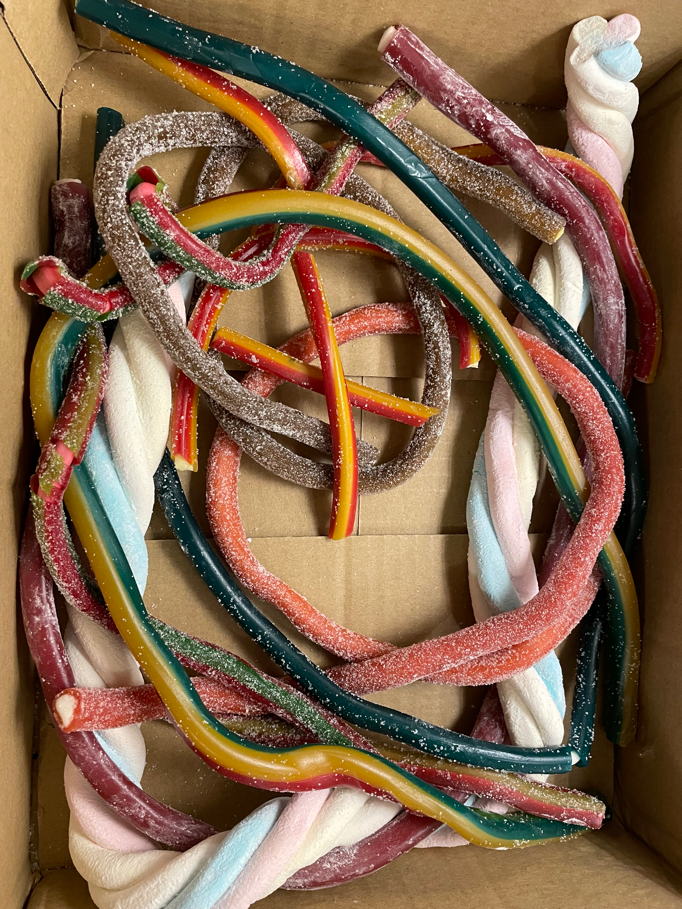
After the title “Last Chance To Learn The Twist” was settled on (by me ), I took a look at 60’s album covers based on the old dance craze, The Twist. I quickly decided not to borrow any of those ideas, because they’re crap. Next, in an act of desperation, I went to an online sweet shop and looked at pictures of candy cane. Nope, no good: they either remind you of Christmas or Halloween. With further examination of the sweet shop products, however, I noticed 7 different types of long, twisty and colourful candy strings. Hmm…
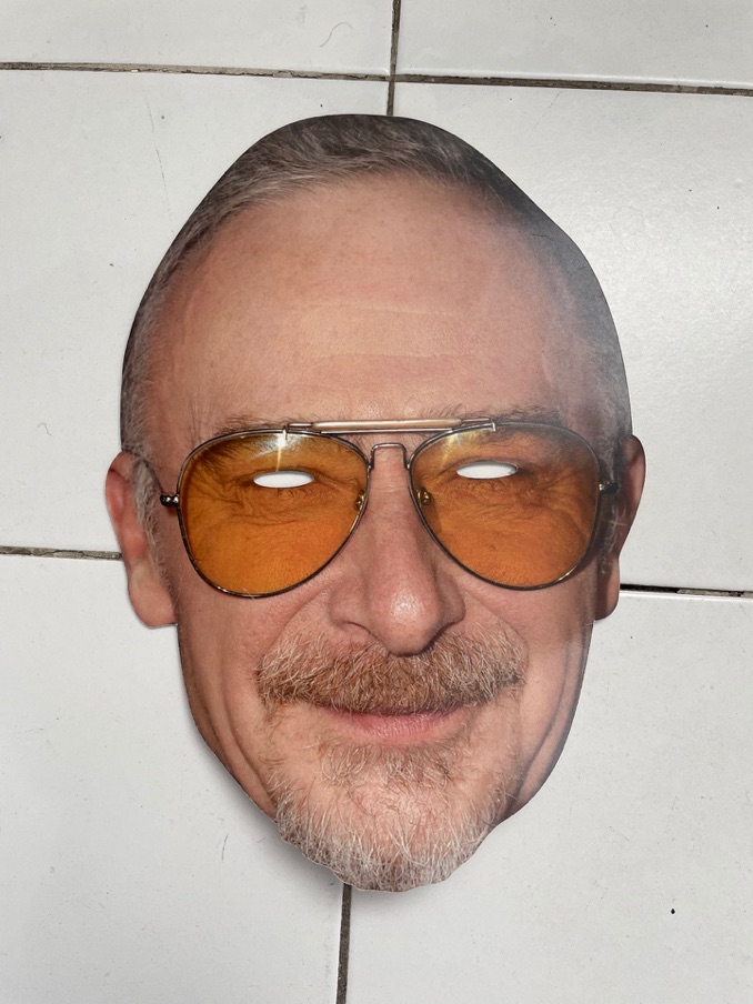
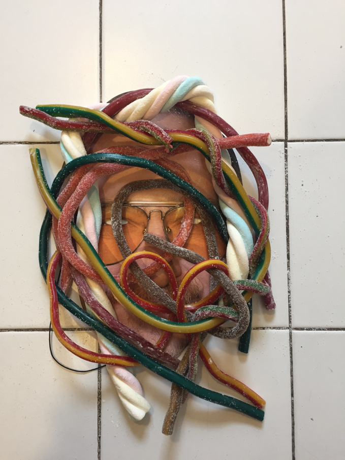
OK, time to grab my celebrity mask (come on, we’ve all got one) and drop it on the kitchen tiles in desperation. Hmm, I muttered again. Then I purchased the twisty candy strings in every colour variety that they had.
I then took the candy strings and flung them on top of the mask, causing a real mess of powdered sugar that was going to require vacuuming after I was done with what might possibly turn out to be a pointless album cover artwork attempt. Hmm (again), this might not be so pointless after all, I began convincing myself. This looks alright!
After bending the candy strings into a shape that interested me (which I panicked about later because the whole thing suddenly looked like a crown of thorns - oops!) I grabbed the iPhone and took some shots.
Here’s the candy strings:
The kitchen floor, the mask and the candy strings:
The kitchen floor, the mask and the candy strings:
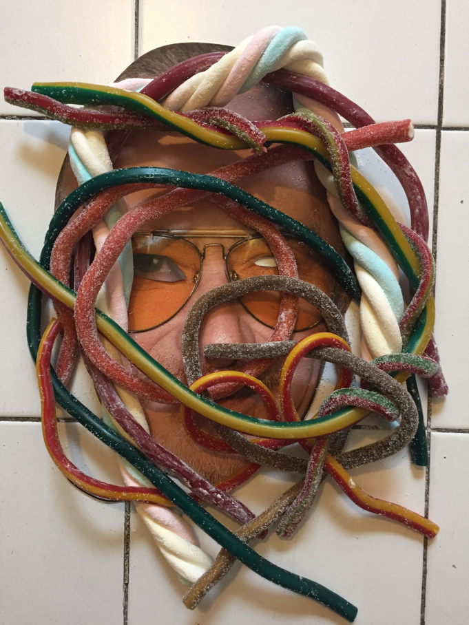
It was missing something. Two blank eye sockets were giving me the heeby jeebies. I needed an equally disturbing but more interesting eyeball addition. Poking around on my iPad I found a photo of me that might have a useful eyeball in it. I printed the shot and cut out an eyeball and wiggled a candy string out of the way to make room for it. I settled on a suitably unsettling droop. Now I’m feeling pretty good, time to send a photo to my son, Jimmy. Album cover designs are always the one thing left that are always behind schedule, at least for any artist that gives a damn about how their songs will be represented, so I better send this image to my clever lad and cajole him into designer mode action asap.
The droopy eyeball is added:
Jimmy went to work with various design approaches which we kept in close contact about, adjusting as we went along.
Here’s two early ones:
Then Jimmy sent this one:
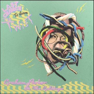
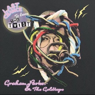
Finally, the words “Last Chance” really pops (he changed the red to yellow later on but I didn’t even notice till now!), well done Jimmy lad!
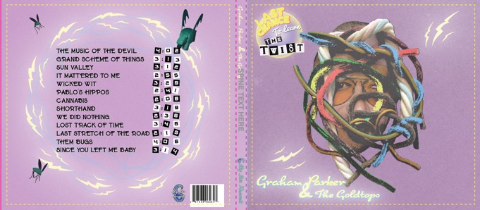
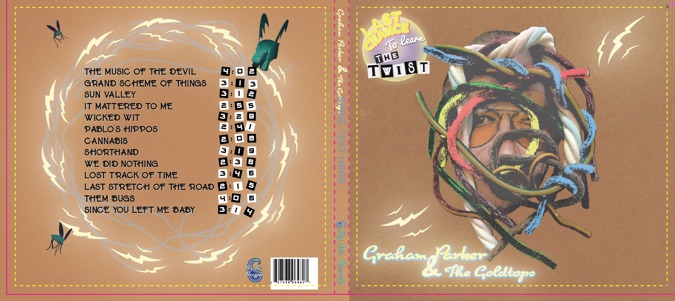
Next, he tried some colour variations and a potential back cover:
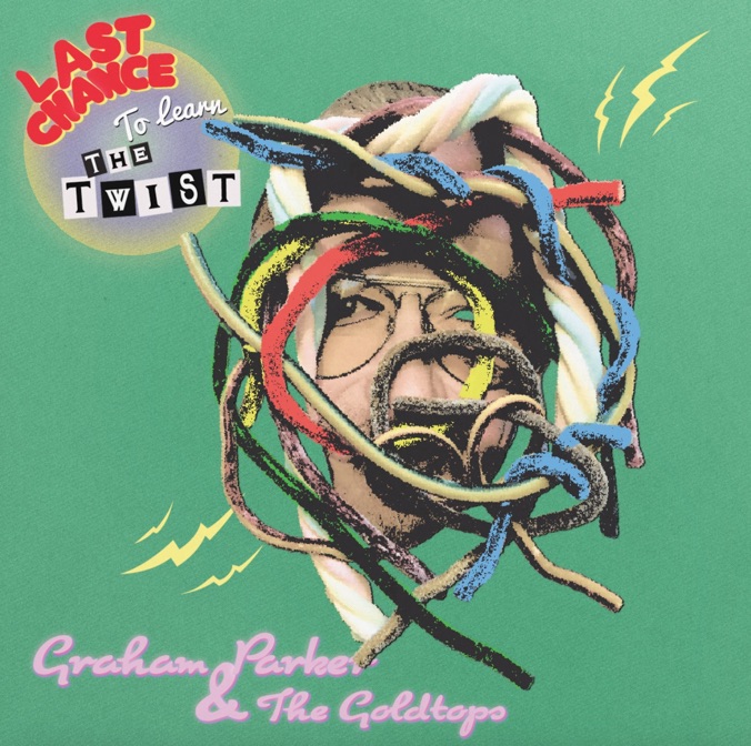
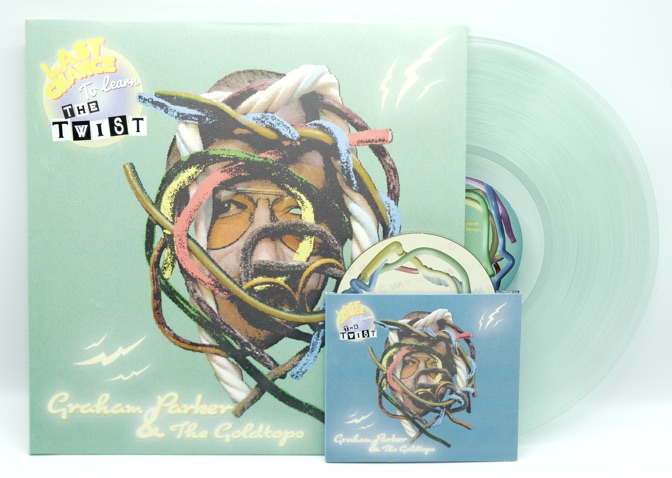
And then…done! Big Stir Records enthusiastically agreed it wouldn’t cost us to do one colour for the vinyl and a different one for the CD.